Two tone cabinetry, especially the grey-and-white combo, has shifted from trend to staple in kitchen design. It breaks up visual monotony, adds depth, and gives homeowners a chance to layer color without committing to a single shade on every surface. Unlike stark all-white or monochrome grey kitchens, this approach balances light and shadow, warm and cool, in a way that feels both current and timeless. Whether planning a full remodel or a weekend cabinet refresh, understanding how to pair shades, distribute tones, and choose hardware will save both time and money, and help avoid the dated look that sinks so many DIY paint jobs.
Table of Contents
ToggleKey Takeaways
- Two tone grey and white kitchen cabinets balance visual contrast while hiding wear—grey lowers conceal scuffs and fingerprints, while white uppers reflect light and prevent ceilings from feeling heavy.
- Successful grey and white pairings depend on undertone matching; warm greiges pair with warm whites, while cool greys match crisp whites, with an ideal shade difference of 3-4 points on the Light Reflectance Value (LRV) scale.
- The grey lower, white upper layout is the most popular two tone design strategy, as it grounds the room, directs the eye upward, and works especially well in kitchens with standard 8-foot ceilings.
- Prep work is 80% of a successful DIY cabinet painting project—degreasing, sanding, and priming are non-negotiable steps that determine whether the finish lasts 2 years or 10 years.
- Unified hardware in finishes like matte black, brushed nickel, or brass harmonizes two tone cabinetry, while semi-gloss or satin sheens unify shades better than matte by reflecting light consistently.
- Test sample paint colors on adjacent cabinet doors over 48 hours under different lighting conditions before committing, as two tone grey and white combinations can shift dramatically from morning light to evening LED task lighting.
Why Two Tone Grey and White Cabinets Are Trending in Modern Kitchens
The rise of two tone cabinets isn’t just aesthetic, it’s practical. Kitchens are workhorses, and monochrome palettes show every fingerprint, scuff, and grease spatter. Grey hides wear better on lower cabinets, which take the most abuse, while white uppers reflect light and keep ceilings from feeling heavy.
From a design standpoint, two tone layouts create visual zones. In open-plan homes, a darker island or base cabinet anchors the kitchen without requiring a full wall or partition. It also lets homeowners integrate existing appliances or countertop materials more seamlessly, stainless steel reads cleaner against grey: butcher block or brass hardware pops against white.
Grey two tone kitchen cabinets have gained traction because grey itself has matured. Early 2010s greys leaned blue or purple: today’s most popular cabinet greys, Repose Grey, Classic Grey, Chelsea Grey, read warmer and more neutral, pairing better with the bright whites (Chantilly Lace, Simply White) common in trim and tile. The combination also ages well. Unlike high-contrast black-and-white or trendy sage-and-cream pairings, grey and white won’t look locked into a specific design moment five years from now.
Finally, two tone cabinets offer flexibility during phased renovations. Homeowners can paint lowers first, live with the result, then tackle uppers, or vice versa, without the kitchen feeling incomplete at any stage.
Best Color Combinations: How to Pair Grey and White Cabinet Shades
Not all greys and whites play nicely together. The key is undertone matching. Warm whites (those with hints of cream or yellow) clash with cool greys (blue- or green-tinted). Likewise, a stark white like Pure White will make a soft greige look dingy.
Warm pairings: If using a greige (grey + beige hybrid) like Agreeable Grey or Accessible Beige on lowers, pair it with a warm white like Alabaster or White Dove on uppers. These combinations work well in kitchens with oak, walnut, or brass accents.
Cool pairings: For true greys like Cityscape or Kendall Charcoal, match with crisp whites like Decorator’s White or Chantilly Lace. This route suits kitchens with stainless appliances, chrome hardware, and quartz or marble countertops.
Light-to-dark ratio: Most successful two tone kitchens use a 3-4 shade difference on the LRV (Light Reflectance Value) scale. If your white has an LRV of 85, your grey should fall between 50-65 for enough contrast without jarring the eye. Paint stores can provide LRV data on request.
Testing is non-negotiable. Buy sample pots, paint 2×2-foot sections on adjacent cabinet doors, and observe them over 48 hours under morning, midday, and evening light. What looks balanced at noon may skew purple under LED task lighting at night.
One more note: sheen matters. Semi-gloss or satin finishes on cabinets are easier to clean than matte, and they unify shades better by reflecting light consistently. Matte can make greys look muddy, especially in north-facing kitchens.
Design Layout Ideas for Two Tone Kitchen Cabinets
How you distribute grey and white makes or breaks the design. There’s no single “correct” layout, but three strategies dominate.
Upper vs. Lower: Strategic Cabinet Placement
This is the most common approach: grey lowers, white uppers. It grounds the room, hides scuffs near the floor, and keeps the eye moving upward toward lighter tones and the ceiling.
In kitchens with 8-foot ceilings, this layout prevents the space from feeling compressed. In kitchens with 10+ foot ceilings or open shelving above uppers, reversing the scheme (white lowers, grey uppers) can work, but requires careful lighting, uppers in shadow will look heavier than intended.
Another wrinkle: if using glass-front uppers, painting the interior backs in the same shade as lowers creates a subtle visual bridge and prevents the “floating” look some two tone kitchens suffer from.
Avoid splitting tones at arbitrary points, like painting only one bank of lowers grey while others stay white. It reads unfinished unless there’s a clear architectural reason (e.g., a peninsula that defines a separate zone).
Island Contrast: Making Your Kitchen Island the Focal Point
If the kitchen includes an island, making it the sole grey (or white) element is a high-impact, low-risk move. A grey island surrounded by white perimeter cabinets draws the eye, defines the work zone, and provides a visual anchor without overwhelming the room.
This strategy works especially well in L- or U-shaped kitchens where the island serves as the main prep and gathering spot. Pair a darker island grey, Dovetail, Gauntlet Grey, or Iron Ore, with bright white perimeter cabinets and a white or light-toned countertop on the island for contrast.
Alternatively, a white island against grey perimeter cabinets can lighten a small or poorly lit kitchen. This approach is common in design galleries focused on compact spaces where maximizing reflected light is critical.
Hardware choice becomes more important with island contrast. Matching island hardware to perimeter hardware unifies the design: contrasting them (e.g., brass on the island, chrome elsewhere) can feel disjointed unless other finishes in the room, faucet, lighting, appliances, tie the metals together.
Choosing the Right Hardware and Finishes to Complement Your Two Tone Cabinets
Hardware is the jewelry of cabinetry, and with two tone designs, it either harmonizes the split or emphasizes it further.
Unified hardware (same finish on all cabinets) is the safest route. Matte black handles and knobs work across most grey-and-white pairings, especially in modern or transitional kitchens. Brushed nickel or stainless leans contemporary and pairs well with stainless appliances. Polished brass or champagne gold adds warmth and works beautifully with greige tones.
Mixed hardware (different finishes on grey vs. white cabinets) is riskier but can succeed if the kitchen already incorporates multiple metal tones. For example: black hardware on grey lowers, brass on white uppers, with a brass faucet and black pendant lights to tie them together. This requires a confident eye and careful balancing.
Pull vs. knob placement: Standard practice is pulls on doors, knobs on drawers, or pulls on both. Avoid mixing pull styles (cup pulls on lowers, bar pulls on uppers) unless there’s a strong stylistic reason. Consistency in shape and size reads cleaner, especially when colors are already doing the talking.
For a professional look, hardware center-to-center spacing should be proportional to door width. On 12-18 inch doors, 3-4 inch pulls work: on 24+ inch doors, 5-6 inch or longer pulls prevent a cluttered appearance. Many examples of hardware proportion appear in curated kitchen portfolios from professional designers.
Cabinet door style also matters. Shaker-style doors, the most common, accept two tone schemes easily. Flat-panel (slab) doors in high-gloss finishes can look stark in grey and white unless the rest of the kitchen (backsplash, flooring, countertops) introduces texture. Raised-panel or ornate doors risk looking dated when painted in two tones unless the home’s architecture supports traditional detailing.
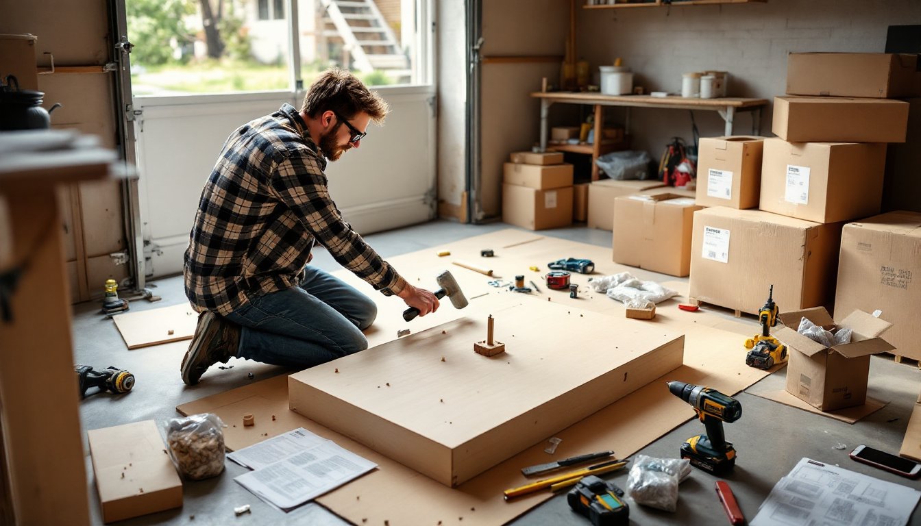
DIY Installation Tips: Painting or Refacing Your Existing Cabinets
Painting existing cabinets is the most cost-effective way to achieve a two tone look, but it’s also where most DIYers cut corners and regret it.
Prep is 80% of the job. Remove all doors, drawers, and hardware. Label everything with painter’s tape and a numbering system, “Upper Left 1,” “Lower Right 3,” etc., so reassembly doesn’t become a puzzle.
Clean every surface with a degreaser (TSP or a TSP substitute). Kitchens accumulate a film of cooking oil that paint won’t stick to. Rinse thoroughly and let dry 24 hours.
Next: sanding. Use 120-grit sandpaper or a deglosser (liquid sandpaper) to scuff existing finish. The goal isn’t to strip the cabinet bare, just to rough up the surface so primer can grip. Wipe dust with a tack cloth.
Primer choice matters. For laminate or previously painted cabinets, use a bonding primer like INSL-X Stix or Zinsser B-I-N. For raw wood, an oil-based or shellac primer blocks tannin bleed. Don’t skip primer, it’s the difference between a 2-year and a 10-year paint job.
For paint, use a 100% acrylic alkyd or hybrid enamel formulated for cabinets (Benjamin Moore Advance, Sherwin-Williams Emerald Urethane). These dry harder than standard wall paint and resist chipping. Apply with a foam roller for flat surfaces and a 2-inch angled brush for edges and details. Two thin coats beat one thick coat every time.
Let each coat cure per manufacturer specs, usually 16-24 hours, before flipping doors or reassembly. Full cure takes 7-14 days: avoid slamming doors or stacking dishes on shelves during that window.
Spray vs. brush: A HVLP sprayer gives the smoothest factory-like finish, but requires practice, proper ventilation, and plastic-sheeting your entire kitchen. For most DIYers, a roller and brush combo is more realistic and still yields professional results if technique is careful.
Refacing (applying new veneer or RTF, rigid thermofoil, to existing cabinet boxes) is an option if doors are damaged but boxes are sound. Kits are available, but installing them correctly, ensuring edges are sealed, veneer is bubble-free, takes patience. Many find it easier to hire a cabinet refacing contractor for this part and handle painting separately.
Safety: Always wear a respirator (not just a dust mask) when priming or painting indoors, even with low-VOC products. Open windows, run fans, and keep kids and pets out until fumes clear. Cabinet painting generates fine particulates and off-gassing that a simple mask won’t filter.
Finally, if the kitchen is the only one in the house, plan the project in phases. Paint and reinstall upper cabinets first, then tackle lowers. That way, the kitchen remains semi-functional and the household doesn’t revolt halfway through. Inspiration and phased project ideas can be found on platforms like homify, which document real renovations with timelines and material lists.